Context
Census began prioritizing fast, simple UI design in order to ship products to market faster. As the product line grew and engineering teams began shipping faster, working with the established design system and component library was increasingly cumbersome. Additionally, after we had lost one of our designers, I found myself at the helm of a large, disparate system that was difficult to manage and maintain by myself.
Opportunity
I had designed a design system for Census, named Tether about 18 months prior to these efforts increasing. During this time, we had an increasingly difficult time making simple UI decisions. I noticed that we had an opportunity to dramatically simplify our design language and "evolve" the system and principles that I had developed for Tether. Thus, allowing us to ship faster, make more consistent decisions, and minimize the decisions I needed to make.
A Design System Language
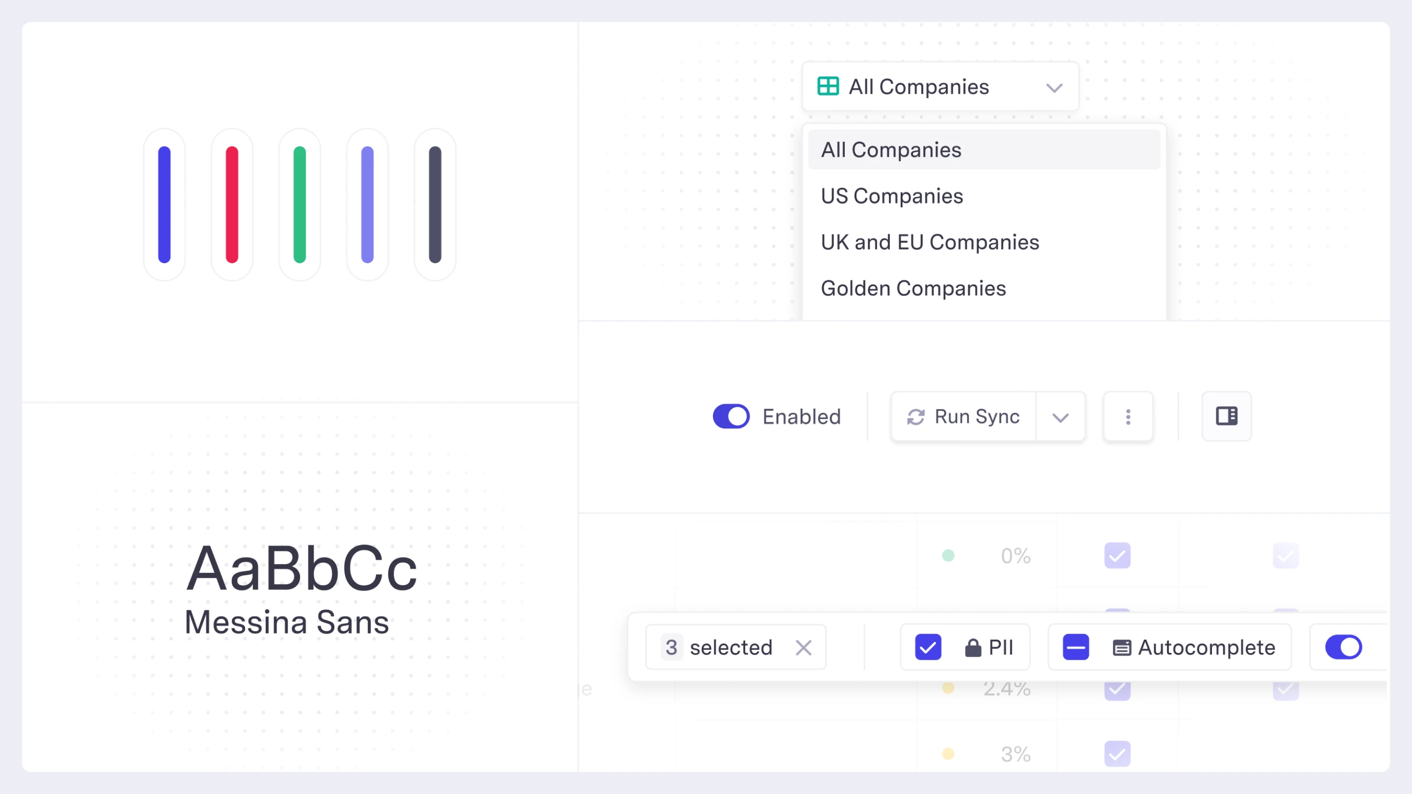
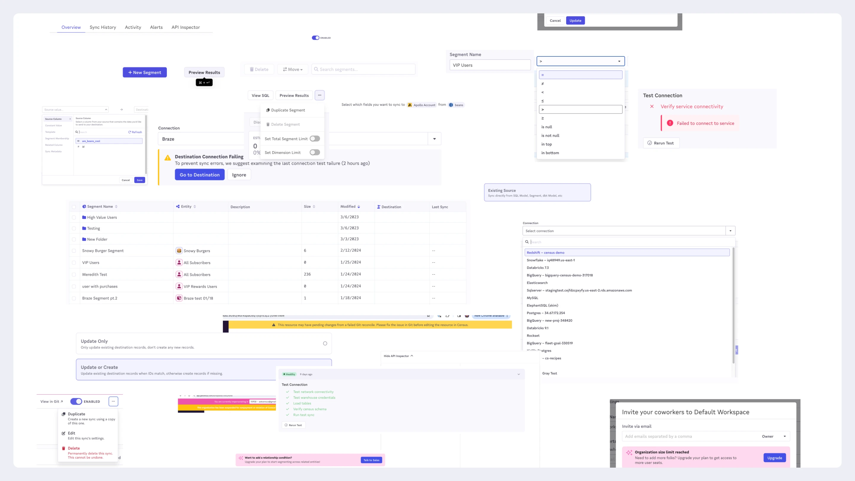
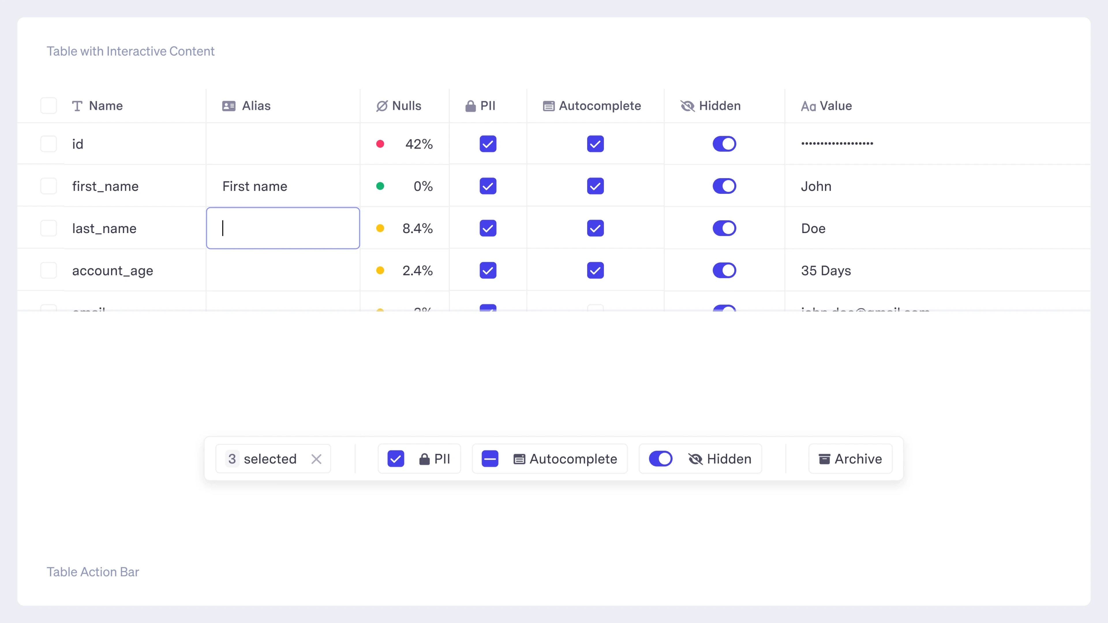
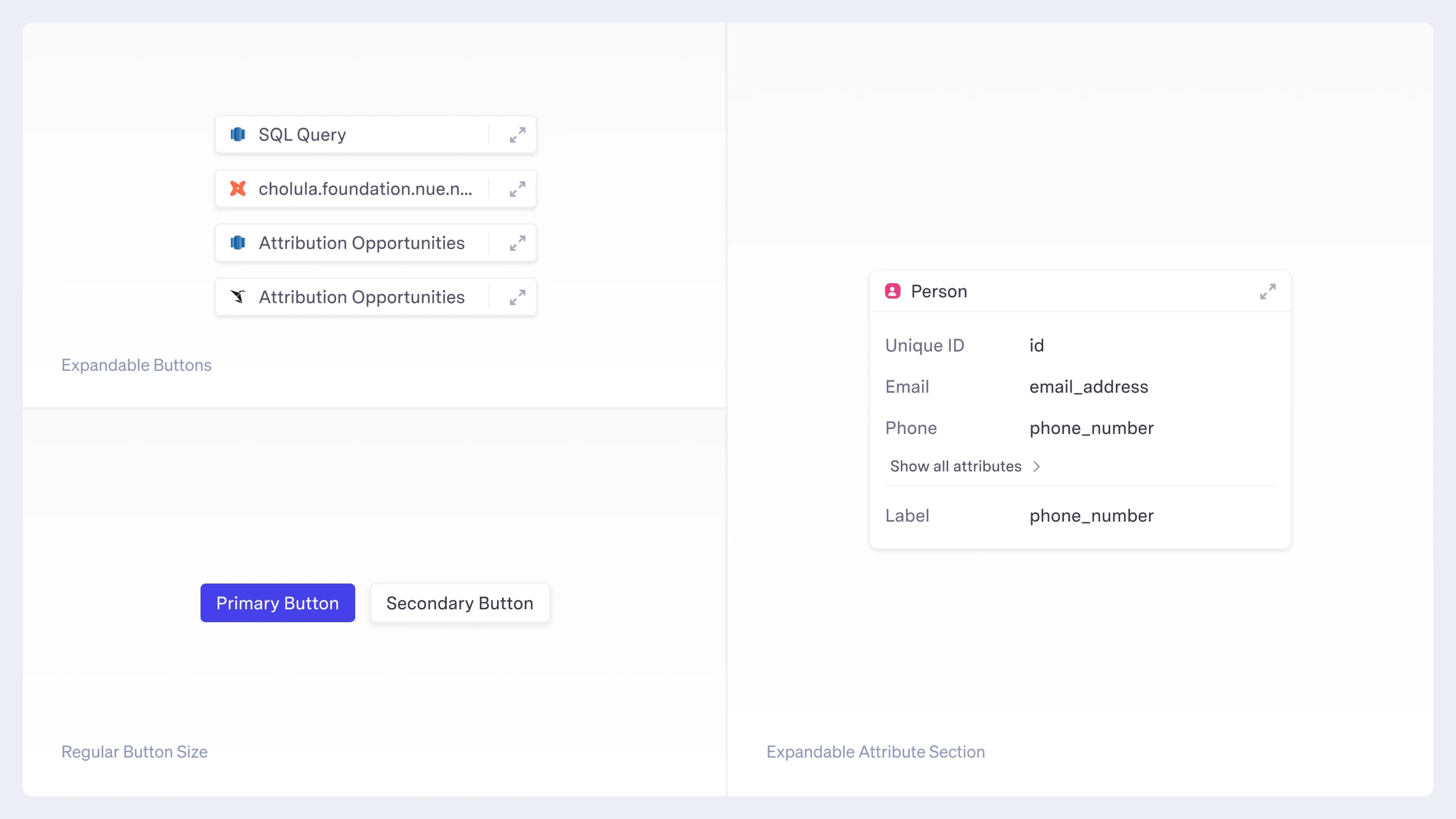
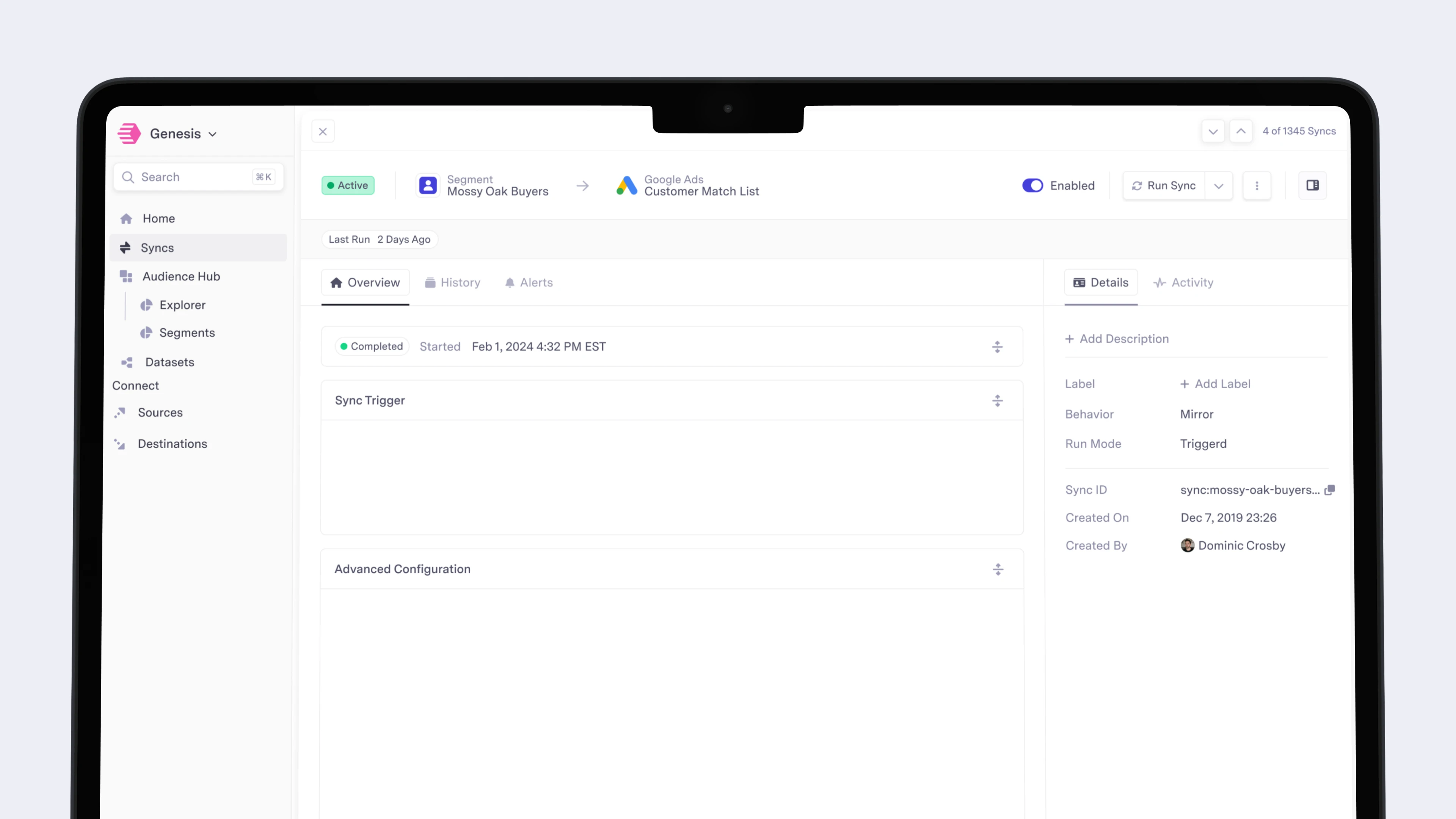
Instead of pushing for a brand new design system, I created a simple design language in order to make designing and implementing UI simple. This reduced the number of decisions to make and the number of tokens to use — both for designers (me) and engineers.

A Visual Revamp
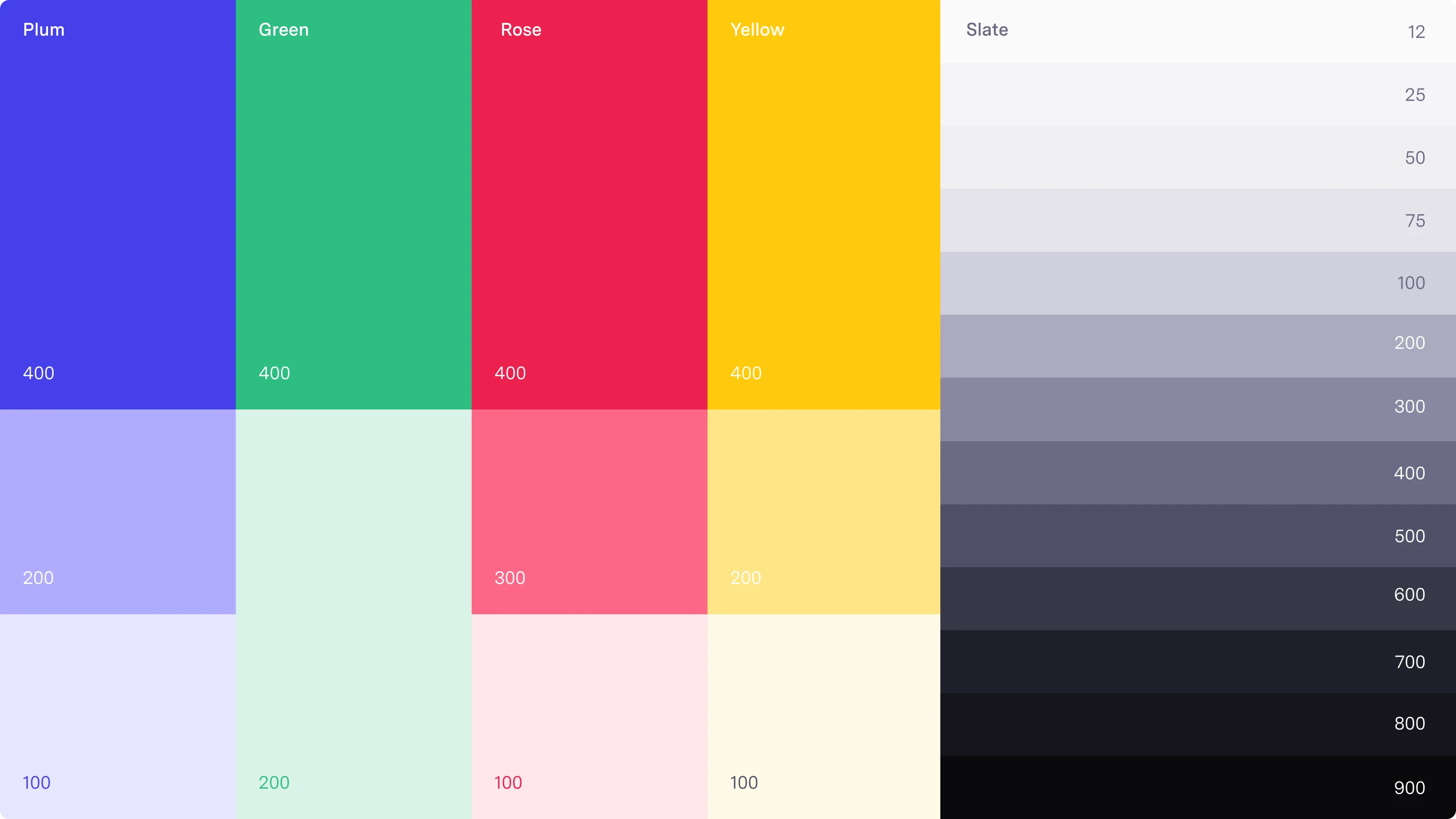
I took this opportunity to address several visual issues that users had run into over the years. I championed picking a new typeface for the UI. I designed the system to use smaller font sizes, tighter padding and margins, and fewer colors. These changes not only simplified decision making, but made the product experience cleaner, clearer, and more understandable.

Learnings
Design systems are important but not applicable for every company and product. They are a factor of scale and scope. Census’ prior design system (also something I designed) required too much decision making and was difficult to implement.